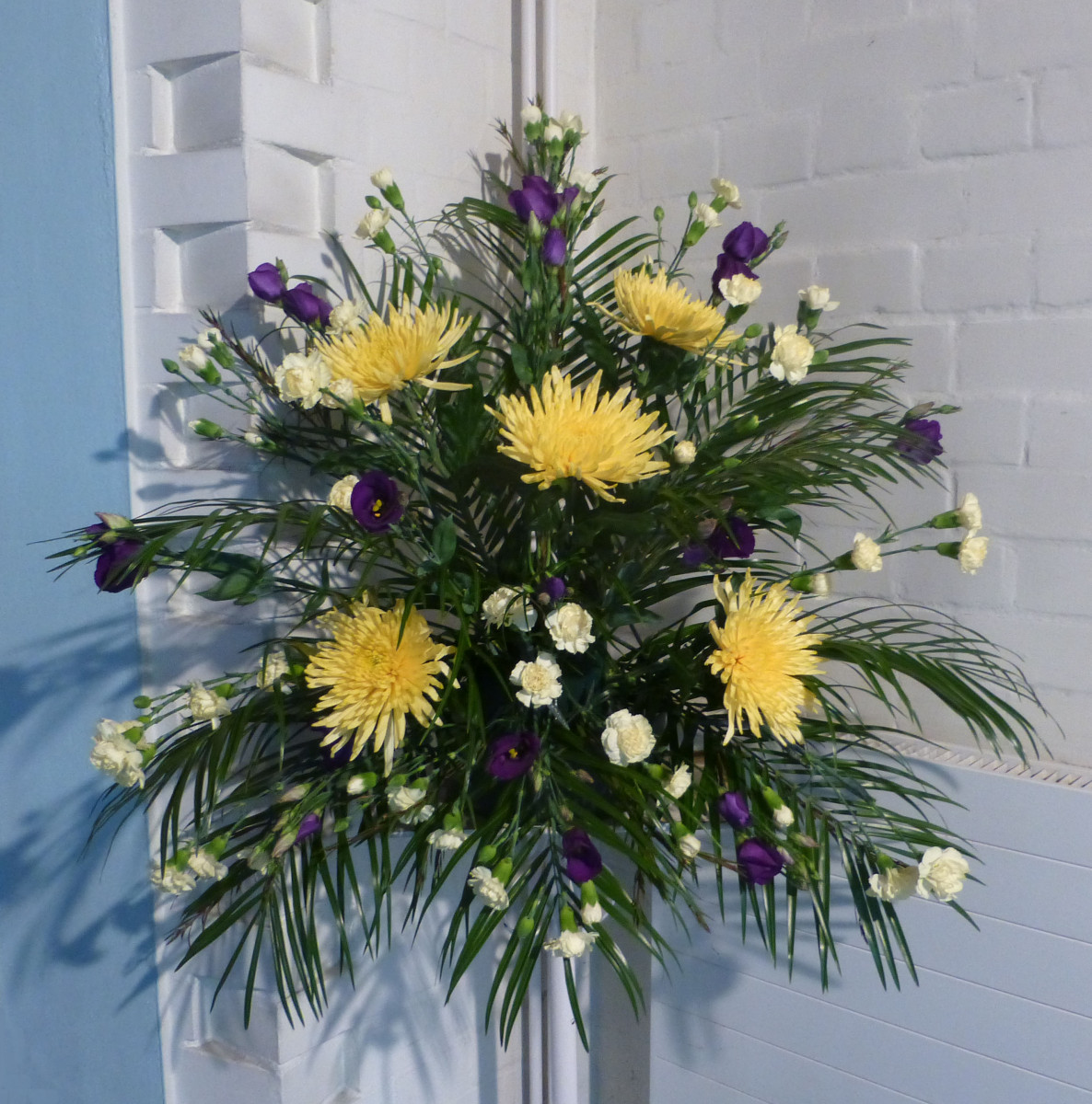
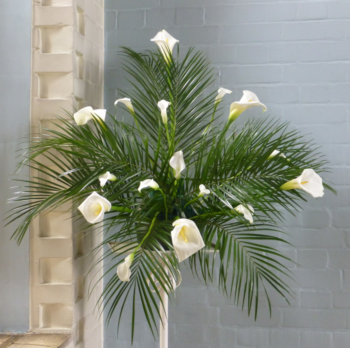
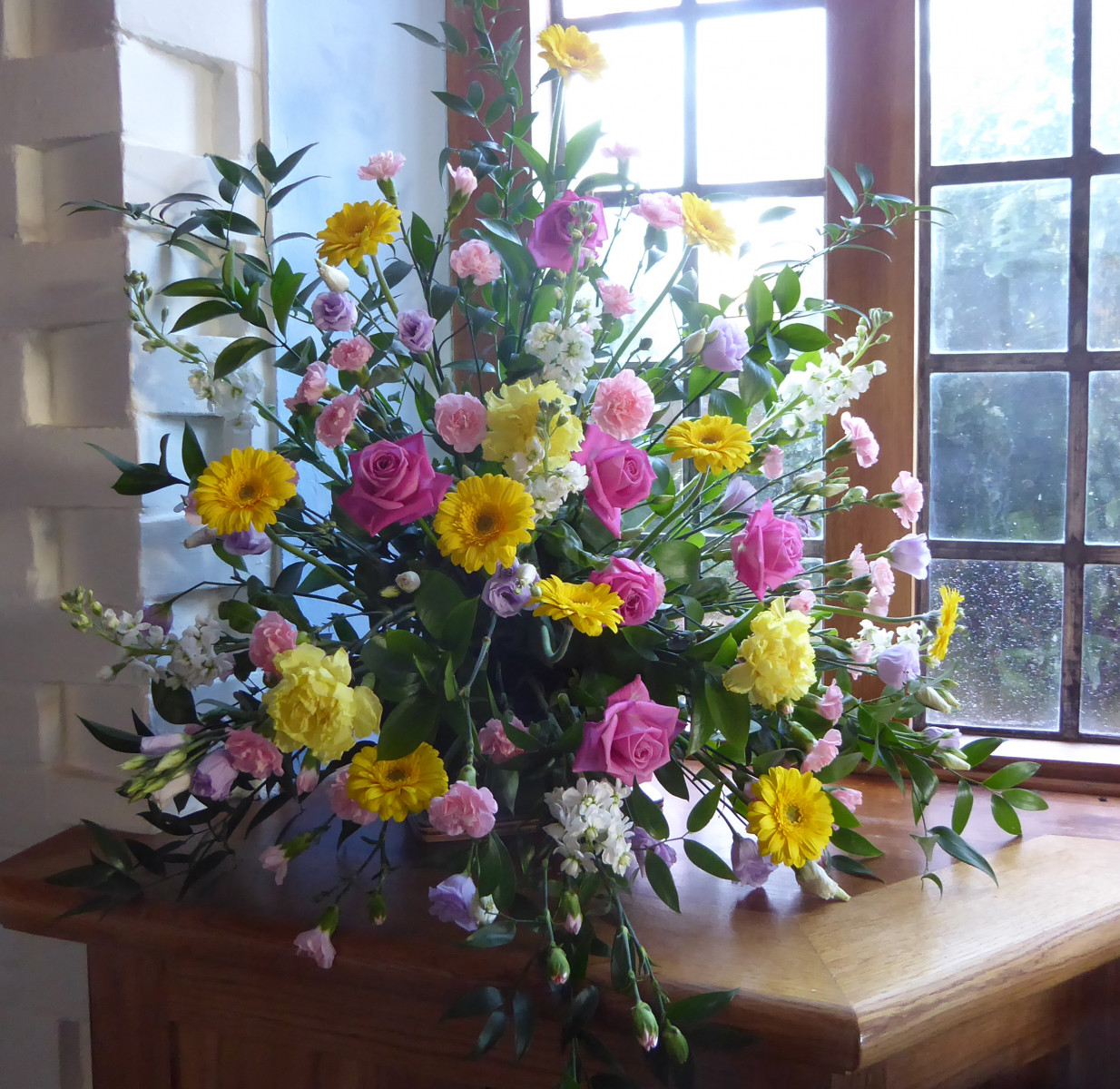
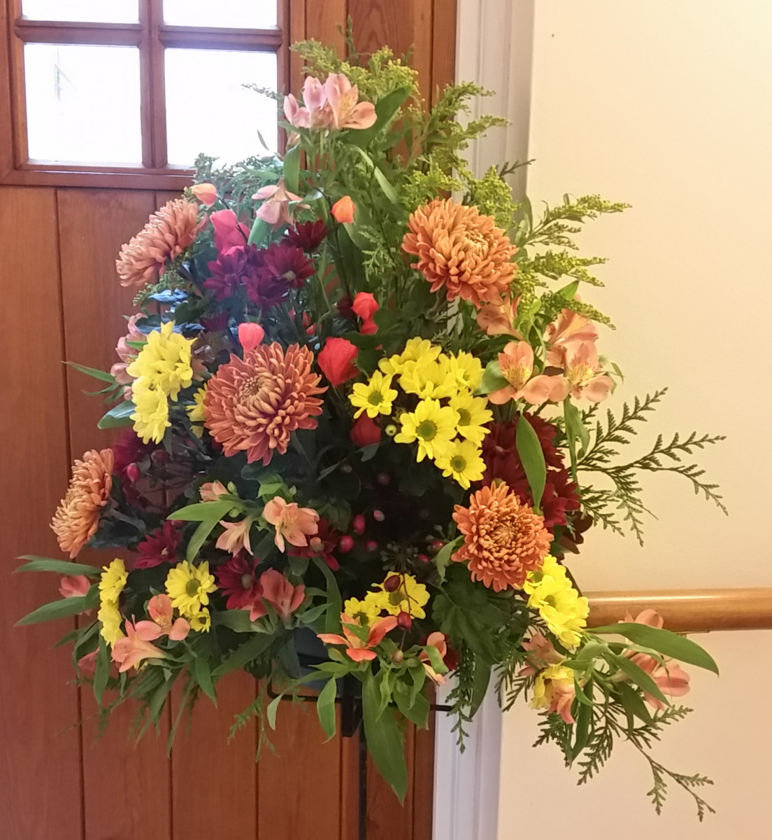
Responsive images (4 almost same size - norminal 25% each - display 4 across on PC and 2x2 on a phone). - we're playing with the widths/heights & letting the image contain do its thing. You may want to set object-fit to cover (defaulting to contain which works better when images are same size/aspect ratio - if your image with a border has white space along top bottom or sides, a fair indication you need to set to cover)
4 differing in size, match the heights, flex will sort the rest? Can we still style 4 on a PC and 2x2 on a phone?
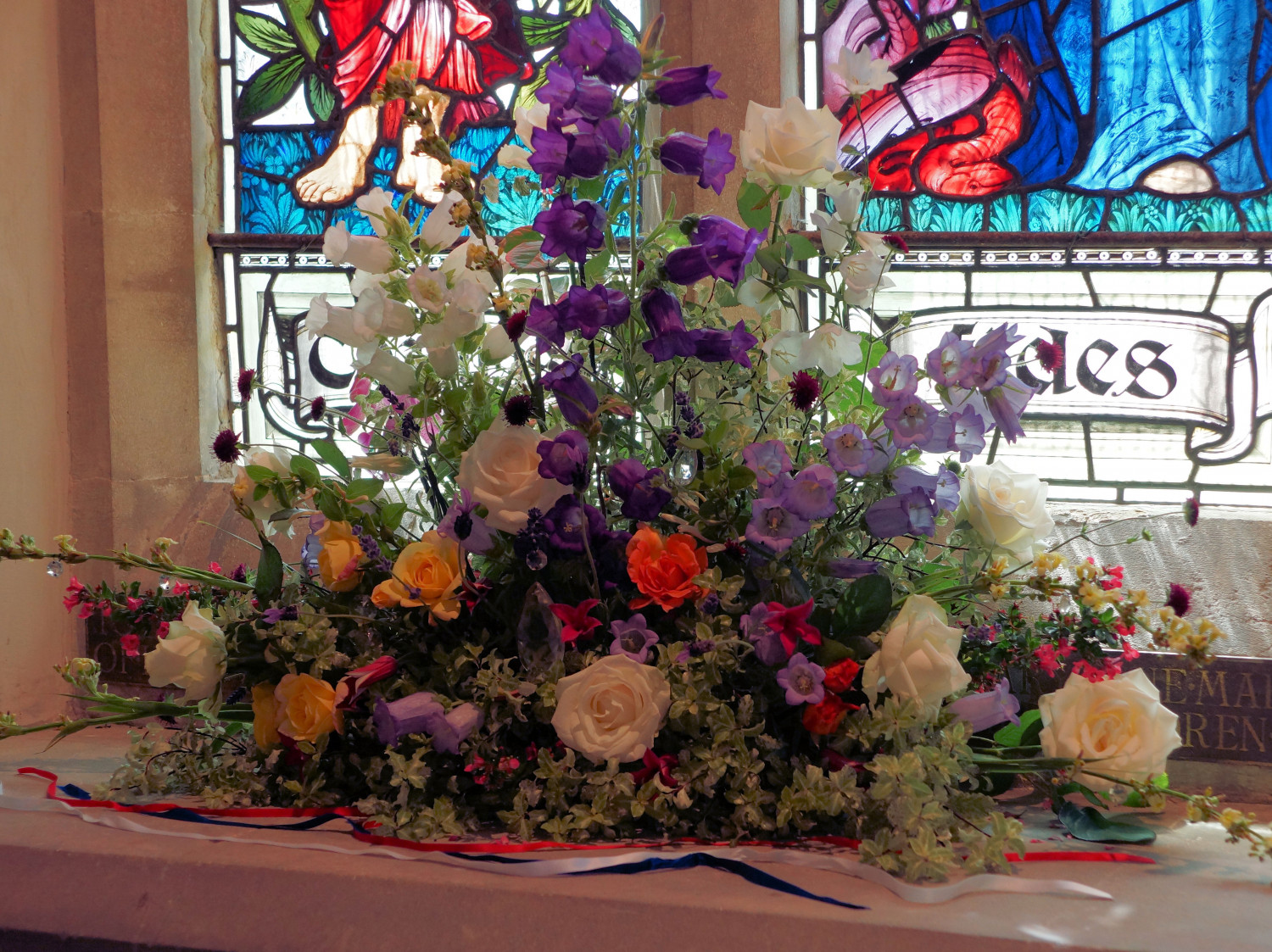
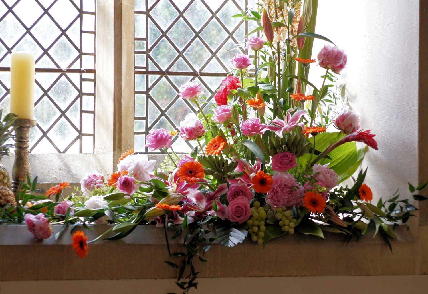
These images we scaled in old site to be matching sizes, set set a height, so can we fix it? These should be 2 in a row on a PC and one above the other on a phone.
Thumbnail test
This is displaying an image (in a thumbnail) along side text. The aim is the thumbnail will take the image, and display near enough OK in the little thumbnail (allowing for all images not always being the same size, and not so easy to just change the size on the image). We are not changing the size of this image, its just to ensure multiple images are same size (and size chosen should work OK as non-responsive).
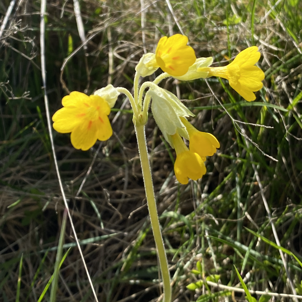 Cowslip (in the primrose family). Another spring flower, found in traditional hay meadows, ancient woodlands and hedgerows, and now in decline. There are lots of folk common names for cowslips including 'Keys of Heaven' (according to legend, St Peter dropped the keys to Heaven and where they landed Cowslips grew) so perhaps apt to find in the graveyard.