When the website is upgraded, we will need to check for the following;
- images, tables, frames need to be set to a percentage - as the page changes size the width is a percentage of the browser page. Although 100% may be a plan (and is set in our style), if your image is only 200 pixels, you will not want it 100% of your browser width on a desktop.
- look for spurious blank paragraphs etc on old pages (these use to be removed by scripts), some will be from old imports from word, others from CKEditor
- consider text - is your text responsive? do you need to apply a width attribute (as a percentage?), does this need to be in the CSS?
- check for all attributes being preserved in the html tags. Some attributes, when saved will get silently removed. This includes things like table cell widths - use the style attribute, iFrame max-width or styling - use a css iframe tag
- its worth checking your page - you can do this by toggling source or for images, pressing the image button and checking any values you have tried to apply are still there on the advanced tab
- consider the images - you may have a size which works sufficiently on a phone and a desktop - but does it need transparency or a border? If your image does not fit your border, check the sizes - you may need to add object-fit:cover; (defaulting to contain) - you can't just fudge sizes to your space in quite the same way!
- consider links and wordwrap/break, especially if you have links. Any long lines may cause issues in responsive pages. Look at the word-break & overflow-wrap settings. There is a value set for tables. But if its a Zoom link, do we want the full link or just words saying Zoom link
How to do buttons
For example:
This is implemented as follows (note: its using < or > with extra spaces so the CE doesn't throw away the text) :
< div style="display:flex; flex-direction:row; flex-wrap:wrap; justify-content:space-evenly; padding-bottom:20px">
< table class="whitewater" >
< tbody>
< tr>
< th> < a href="URL">Donate to Hook< /a> < /th>
< /tr>
< /tbody>
< /table>
< table class="whitewater" >
< tbody>
< tr>
< th> < a href="URL">Donate to HMR< /a> < /th>
< /tr>
< /tbody>
< /table>
< /div>
In the above example, there's no need to give a size to each table.
How to get flex to flex
If you are adding an image, use for example something like this:
you need to use display:flex around it.
Images
If you have an image you can either use dsiplay:flex, and suitable flex attributes OR can style widths by a percentage
There are new classes you can use... they do the job
- flex-container
- KEEP 1 ROW: flex-1-col, flex-2-cols, flex-3-cols, flex-4-cols, flex-6-cols - effectively divide screen up into that number of columns - and resize
- CHANGE NUMBER OF ROWS: flex-2-1-cols, flex-3-1-cols, flex-4-2-cols, flex-3-2-cols - these do what they say on the tin
This is an example (note: its using < or > with extra spaces so the CE doesn't throw away the text) ::
< div class="flex-container">
< div class="flex-4-2-cols">< img alt="SJC" class="border" src="/content/pages/uploaded_images/1656358517-jD6aR5w8.png" />< /div>
< div class="flex-4-2-cols">< img alt="Heckfield" class="border" src="/content/pages/uploaded_images/1656358569-bozxKROG.png" />< /div>
< div class="flex-4-2-cols">< img alt="Mattingley" class="border" src="/content/pages/uploaded_images/1656358589-PTizhL3W.png" />< /div>
< div class="flex-4-2-cols">< img alt="Rotherwick" class="border" src="/content/pages/uploaded_images/1656358607-dr2wgjFU.png" />< /div>
< /div>
Obviously this assumes your row of images are the same size. You can apply style such as style="flex:63%; max-width:62%", to fit other sizes. But your flex area must be the same or larger than your max width (to leave gaps).
How to include a frame
This example is the frame from the location page - you will want to set the containing paragraph to flex, and includes the following (your sizing may be different, but if you do not set sizes on the frame, it will start the wrong size!):
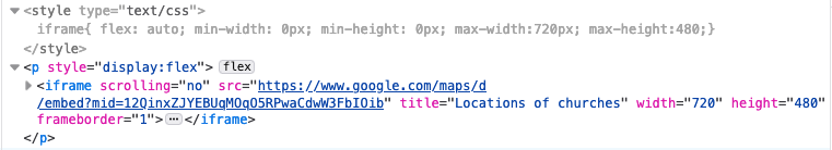
Again your frame will need to be within a flex container.
If your frame is a video, we've some classes that manage videos. For Landscape:
- container is iframe-wrapper
- contents is iframe-style
There will eventually be a portrait version, but we have portrait videos only in one place, and the 2 column flex-2-cols is close enough (for now)
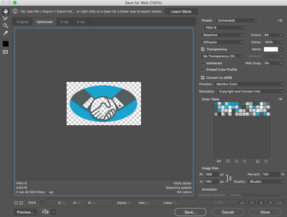
How to create an image with transparency
How to change image to have transparency, the easiest way is to use a tool such as photoshop
- open your image in photoshop
- export->save for web (legacy)
- We are saving as png or gif (as these are the only formats which support this), and using a reduced colour table
- select any of the colours which you want to be transparent (typically selecting white or a small number of offwhite) - click on each one in turn & then on the transparency button. In this example, 17 colours have been set to transparent.